Reflection
I did not know what to expect when I enrolled into this subject, it was my second university class ever. I found that I learnt so much through this unit, ideas such as personas, different ways of thinking, learning how to create a blog and to look at projects from the users point-of-view were just a few things I learned. Each class was full of useful information and we practiced using these strategies especially when we created our app prototype. This activity showed me a different side of design that I thoroughly enjoyed and from here I was able to decide my specialist major.
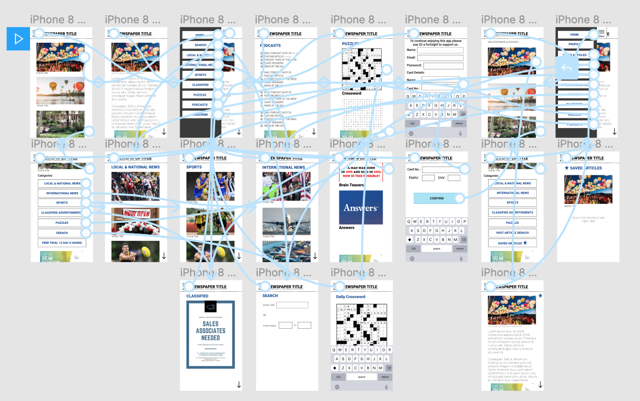
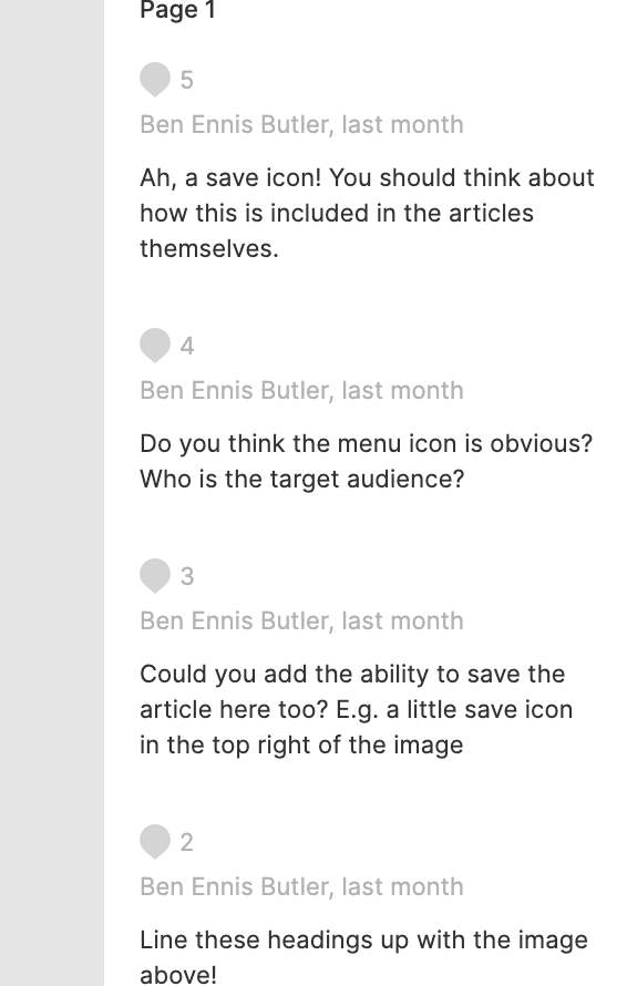
During the creation of my app I discovered that testing each part of the app was crucial and getting feedback from my peers and teacher helped me to see problems that I hadn’t seen beforehand. While developing the application in the group in class, we talked about points that would be pivotal to the success or failure of the application. In particular the audience we would have for a newspaper application meant that we needed simplistic controls and large headers. We had to follow Don Norman’s concept of “Functional, Easy to Use and intuitive” and make sure that the app was all of these things. From what I learnt in this class activity I was able to apply some of the ideas I had used in the prototype into my website, ideas such as large headers, engaging images and a minimalistic approach of the overall layout.
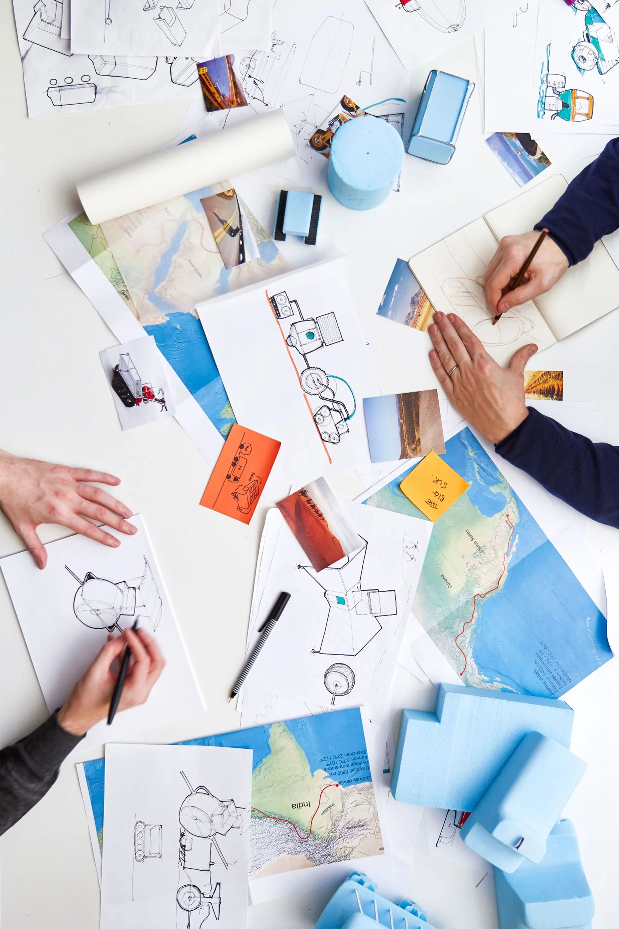
In my design intentions post I talk about having a “very simplistic blog by using black, whites and grey tones as the prominent colours and then any images used were minimalistic and often had grey tones backgrounds”, after working on my blog the past semester, I decided that the layout I made was simple and a great way to showcase my work. I enjoyed the site itself but I didn’t enjoy how bland it looked, I am a very colourful person so I went over my blog and created changes such as creating a logo that I put in the footer and then I introduced those colours to the rest of the blog to make it all coherent. As well as changing the font colours I incorporated new images for my blog posts, these images had more depth and interest in them. These changes came from ideas I used in my app prototype as I stated before, but through these small changes, I feel my blog is now showcasing me as a designer.
My overall blog layout has not changed to a large extent, the concept of simplicity and minimalism were kept in the blog. I decided not to change the layout because the layout I used in the application prototype was very similar and made the app “functional, easy to use and intuitive” and I felt this was a great way for my website to be as well. I also had some of my peers review my website and they concluded that my website was easy to navigate. My feedback in the first part of the assessment stated the same so thus I felt the layout would be best staying the same as when I first submitted it. So instead of changing the layout I added to it, changing the colour scheme as already stated and adding in a portfolio section for my future works so my audience, my personas which I stated in my ‘Design Intentions’ blog post, could clearly see the type of work I create as a designer.
In conclusion, as I have learnt more within my ‘Intro to Interaction and User-centred Design’ course I have adapted and changed my website and blog posts.


